
WARNER Edwards – the Northamptonshire-based, super-premium gin – has rebranded to Warner’s as part of a brand refresh.
The name change comes into effect with immediate effect and is being launched alongside a new visual identity, which includes a redesigned brand logo, revised labelling and updated product names.
Following extensive consumer and product research, the brand identity and logo has been reimagined to reflect the shortened name change – all with the aim of increasing stand-out on shelf, encouraging greater product recall and narrating the brand story more clearly. The changes to the logo include:
* Warner’s brand name: the shortening of the overall brand name has enabled a sizing increase
* Brand triangle: the iconic Warner’s brand triangle is instantly recognised by brand fans, so has remained integral to the logo. The shape represents the gable of the Falls Farm barn where every bottle of Warner’s gin is distilled
* Farm Born British Gins: this text has been included above the logo in order to better reflect the brand story and its position within the gin industry
* English lion and Welsh dragon: as a nod to both original founders, the logo has retained both an English lion and a Welsh dragon
* Curiosity – Falls Farm’s copper still: the negative space between the lion, dragon and Martini glass has become more pronounced to better show the outline of the bespoke copper still, Curiosity
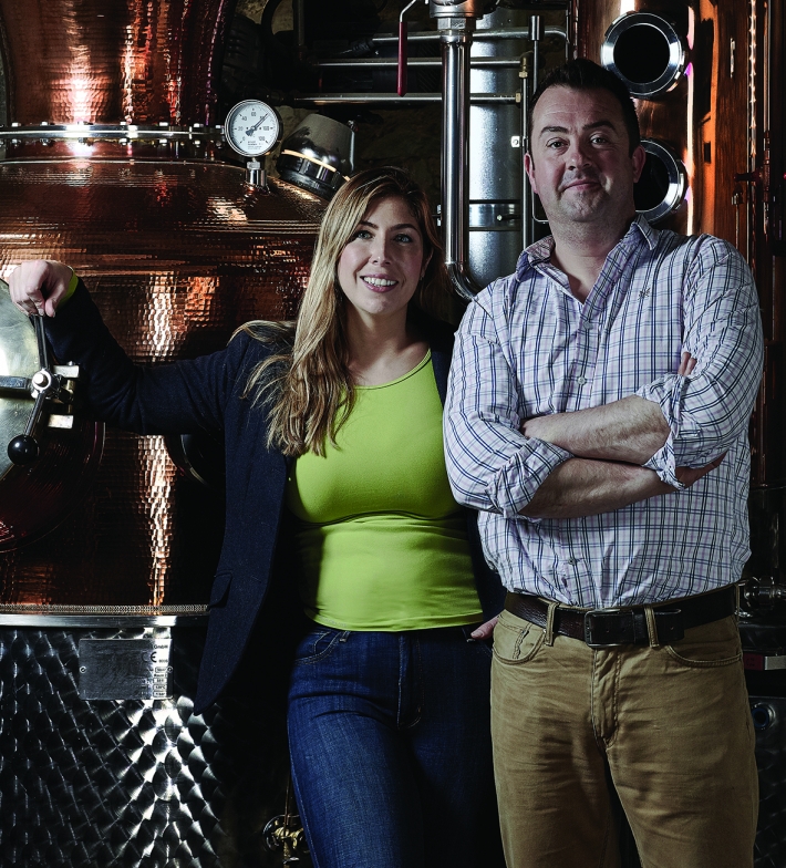
Founded in 2012, Warner Edwards was originally named after two of the founding partners of the company, and is now led by husband and wife team, Tom Warner and Tina Warner-Keogh. The brand has enjoyed unprecedented growth in recent years, becoming the number one super-premium gin in both the on and off trade for the flavoured gin category, seeing a 142.58 per cent annual sales rise over the past three years and securing sixth place in The Sunday Times Fast Track 100 2018.
Founder, Tom Warner, who launched the gin brand on his family’s farm, said: “We’ve had quite the journey since we started back in 2012. Our team has worked incredibly hard to get the brand to where it is and it’s this hard graft – coupled with great care for the environment and sustainability – that has enabled us to create epic gins and a brand we’re immensely proud of. We’ve enjoyed continued growth year-on-year, which has allowed us to keep innovating and driving the category.
“The change of name to Warner’s feels like a natural evolution for us – our customers have been shortening our brand name to Warner’s for years, so now is the right time to make the change. Warner’s also better represents our current team and, combined with our new look and feel, should give us better stand-out on shelf and increased brand recall, so it’s a no-brainer.”
Tina Warner-Keogh added: “We’re a proudly farm-born, inventive and big-hearted brand, and we wanted to challenge ourselves to better deliver our epic brand story through our product look and feel. The work that has been done to the logo and new brand visual identity means our narrative is now clearer and more impactful. It’s a really exciting time for us, and we can’t wait to share this with our fans.”
As well a new visual identity, the brand has created more succinct product names for some variants in its portfolio, which have gone live with immediate effect. This coincides with the new identity rolling out across print, digital assets and a new website, which has moved to www.warnersdistillery.com. All social handles across Facebook, Twitter and Instagram are now @WarnersGin.
The new brand look and feel, including the updated labelling and logo re-design, has been created by London-based strategy, design and communications agency, Hue & Cry.